2026.05

Corepage
About Project
코어페이지는 소상공인을 위한 온라인 교육 플랫폼 브랜드입니다.
코어페이지의 이름처럼 ‘Core(핵심)’를 정리해 하나의 ‘Page(결과물)’로 완성할 수 있도록 돕습니다.
온라인 마케팅과 브랜딩에서 “무엇이 가장 중요한지”를 명확히 제시함으로써,
비전문가도 쉽게 이해하고 적용할 수 있도록 설계된 실무 중심 교육 브랜드입니다.
Online Education Platform for Small BCorepage is an online education platform designed for small business owners.
As its name suggests, it distills complexity into the Core—a single Page where insight becomes outcome.
It clearly defines what truly matters in marketing and branding,
enabling non-experts to understand and apply it with clarity and confidence.usiness Owners


코어페이지는 핵심만을 간추려서 보다 빠르고 정확한 학습이 가능하도록 합니다.
브랜드 철학이자 슬로건인 ‘Core Learning’을 바탕으로 과도한 정보 속에서
무엇이 중요한지 판단하는 기준을 세우고, 스스로 실행할 수 있는 학습 방식을 목표로 합니다.
Corepage distills complexity to its core—what truly matters. Guided by Core Learning,
it sets a clear standard within information overload. Enabling learners to understand, decide, and act with clarity.
Design Concept
Core Expansion
코어페이지의 디자인 컨셉은 “핵심의 확장”입니다.
이는 책이 펼쳐진 모습과 기어가 맞물리는 기하학적 형태를 통해 핵심을 이해하고 결과로 만들어가는 학습 과정을 상징적으로 표현합니다.
심볼은 중심(Core)을 기준으로 교차하고 확장되는 구조를 통해 교육의 본질을 밑바탕으로 성장하는 모습을 담은 디자인입니다.
코어페이지가 지향하는 핵심 중심 학습과 가치 실행을 상징합니다.
The design concept of Corepage is “Core Expansion.”
It captures a learning process where core ideas are clearly understood and transformed into meaningful outcomes, inspired by an open page and interlocking gear.
The symbol is structured around a central Core, forming an intersecting and expanding system.
This structure reflects growth grounded in the essence of learning,
embodying Corepage’s approach to core-driven learning and value-driven execution.


Design System
A system that expands from a structured core.
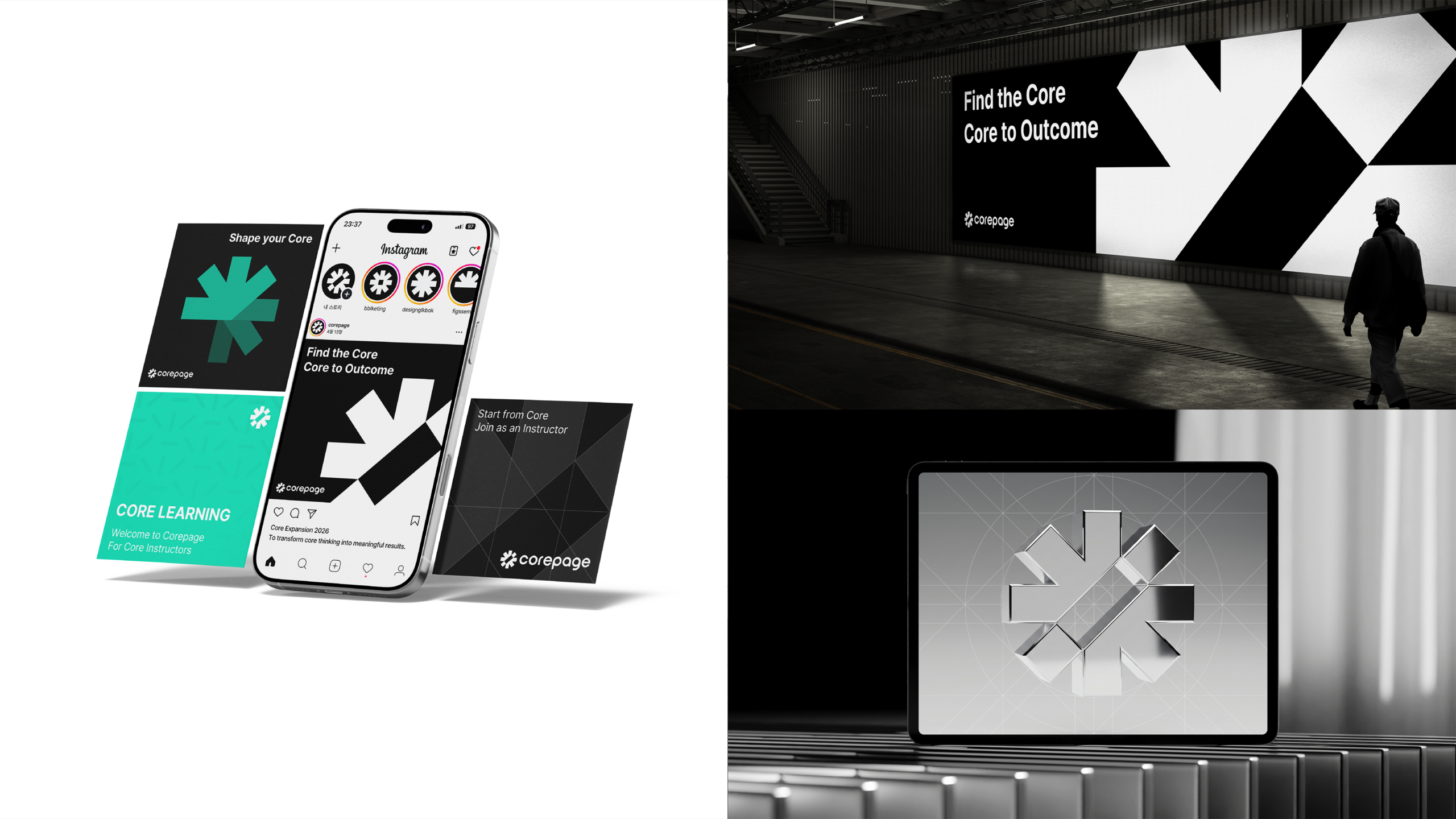
코어페이지의 디자인 시스템은 그래픽 모듈을 기반으로 확장됩니다.
그래픽은 회전, 결합, 반복을 통해 다양한 형태와 패턴으로 발전하며, 일관된 시각적 구조를 형성합니다.
이는 핵심(Core)을 중심으로 확장되는 방식을 반영한 것으로 브랜드의 아이덴티티를 직관적으로 전달합니다.
Corepage’s design system is built on graphic modules.
The modules evolve into various forms and patterns through rotation, combination, and repetition, forming a consistent visual structure.
This reflects a structure that expands from the Core,intuitively conveying the brand’s identity.


Color System
Clarity & Focus
코어페이지의 컬러 시스템은 복잡함을 단순화하고 집중도 높은 시각 구조를 형성합니다.
밝은 청록 컬러는 명확함과 방향성을 부여하며, 블랙과 화이트는 구조와 균형을 형성합니다.
이 대비는 정제된 시각적 위계를 만들고, 정보를 정확하고 직관적으로 전달합니다.
Corepage’s color system simplifies complexity and establishes a focused visual structure.
A bright teal accent introduces clarity and direction, while black and white provide structure and balance.
This contrast defines a refined visual hierarchy, enabling precise and intuitive communication.